Colophon
What is a colophon?
I may have first encountered the notion of a colophon in a Chinese humanities class in undergrad, during a section on handscrolls (like the one below, apparently made around 1310 CE). These were typically commentaries by later scholars and artists, providing context for the work and/or artist and expressing admiration.
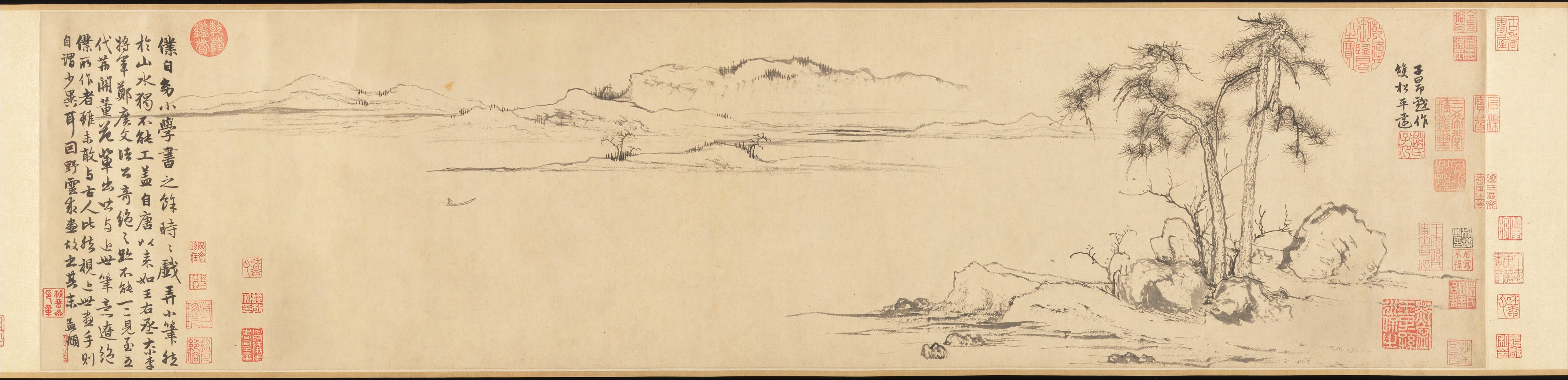

The colophons for this painting are in separate images but translated on The Met’s page for the work, linked to in the caption. I've excerpted them below because they’re wonderful.
From Yang Zai (楊載):
My native home is a hut beside the great river,
But for many years now I have lived away in the capital.
Today it is as if a fishing pole had come into my hands,
As I enjoy perusing this painting.
From Tong Xuan (童軒), born more than 100 years after this painting was made:
The Twin Pines, Pure and Distant scroll, painted and inscribed with a colophon by the respectable Zhao Wenmin [Zhao Mengfu] of Wuxing [in Zhekiang], has been acquired by Academician Suxuan [Qian Ning], who appreciates it profoundly. Suxuan’s character and family background compare closely with Wenmin’s, so, respecting the man, he loves his painting.
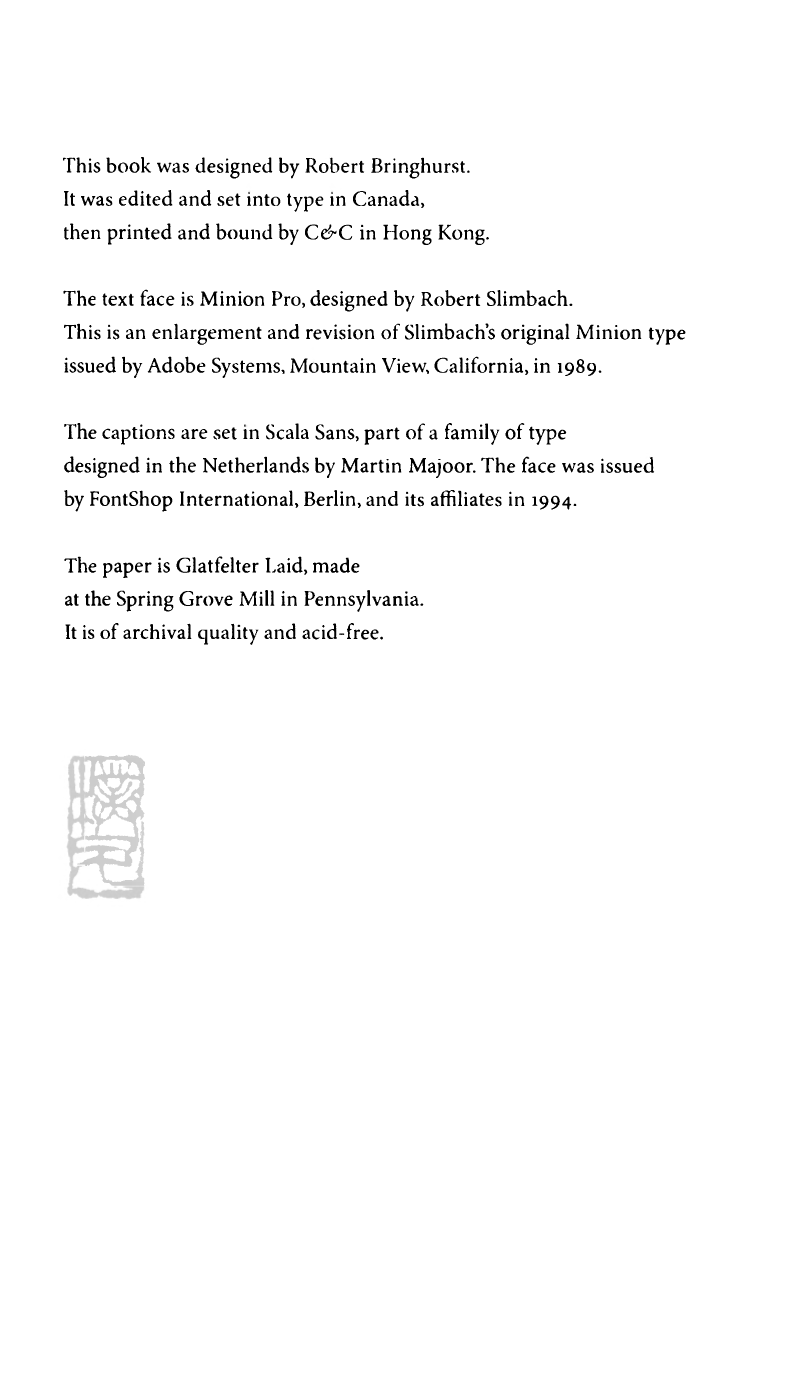
Or I may have first encountered the notion in William Bringhurst’s gorgeous book The Elements of Typographic Style, after which I’ve wanted to use Minion for just about everything. This aligns more with how websites typically employ a colophon.
Technology
This site is built using Astro, and is based on their portfolio template. I'm not very skilled with JavaScript, but I've had to use very little to get this running. My favorite feature of Astro is likely the built-in APIs for managing what it calls “content collections,” often used for, say, blog posts, but which I’ve used so far to manage my portfolio pages, all composed in Markdown.
Typography
Body text (like this) is set in Work Sans, a free, libre, open source typeface by Wei Huang.
Headers are set in Cormorant Garamond; that is, the Garamond style of the Cormorant family developed by Christian Thalmann. Cormorant is also free and open source, and you can contribute to it on GitHub or read about it on Behance.
And the site title and navigation are set in Cormorant Infant because I find it delightful.